Assignment for Introduction to Psychology this past summer: create a model of a neuron and submit a labeled photograph.
The myelin sheaths are rolled-up plant labels, while the nucleus and ends of the axion are brass beads. Everything other than the beads is solid copper.
Showing posts with label bucks county community college. Show all posts
Friday, November 15, 2019
Sunday, May 15, 2016
Presentation box for my letter opener
Yesterday I finished up my fine woodworking fundamentals course. There were exactly two projects in this class (aside from doing a practice set of dovetail joints), a picture frame and a box. I'm not publishing the picture frame because it's very plain and uninteresting.
I made the box to fit the letter opener I finished in September. The finger joints reminded me of masonry, so it's obviously inspired by West Asian architecture, particularly the palaces of Persepolis.
It consists of American or black walnut and soft maple. Unfortunately, the walnut's color varied a lot through the plank. For finishes I had a choice of boiled linseed oil, tung oil-based varnish or water-based polyurethane, but being short on time, I was forced to go with the polyurethane, so its finish is still a bit rough (the professor noted that polyurethane, in her words, "bubbles" a lot when brushed on; it requires repeated sanding to look good).
It has two brass-plated steel hinges. Sadly, copper to match the letter opener's furniture seems to be unavailable. I might try to fabricate my own in the future. The letter opener and scabbard are supported by two inserts carved from rigid pink insulating foam and covered with epoxied polyester suede cloth. A considerable amount of epoxy seeped through the cloth; clearly I should've found something with a non-porous back.
Because the box is so small and cut to fairly tight tolerances, it's feasible to have the upper insert rest on a pair of narrow shelves over the lower one so the box can be more compact.
This was a good class for learning the use of the major standing equipment and how to get the greatest precision in fit. Most of the work is (if you do it correctly) done on the planer, table saw and routing table, machines with which I was totally unfamiliar before. It also gave me a chance to get started on a handful of personal projects which I can finish up over the summer.
I made the box to fit the letter opener I finished in September. The finger joints reminded me of masonry, so it's obviously inspired by West Asian architecture, particularly the palaces of Persepolis.
It consists of American or black walnut and soft maple. Unfortunately, the walnut's color varied a lot through the plank. For finishes I had a choice of boiled linseed oil, tung oil-based varnish or water-based polyurethane, but being short on time, I was forced to go with the polyurethane, so its finish is still a bit rough (the professor noted that polyurethane, in her words, "bubbles" a lot when brushed on; it requires repeated sanding to look good).
It has two brass-plated steel hinges. Sadly, copper to match the letter opener's furniture seems to be unavailable. I might try to fabricate my own in the future. The letter opener and scabbard are supported by two inserts carved from rigid pink insulating foam and covered with epoxied polyester suede cloth. A considerable amount of epoxy seeped through the cloth; clearly I should've found something with a non-porous back.
Because the box is so small and cut to fairly tight tolerances, it's feasible to have the upper insert rest on a pair of narrow shelves over the lower one so the box can be more compact.
This was a good class for learning the use of the major standing equipment and how to get the greatest precision in fit. Most of the work is (if you do it correctly) done on the planer, table saw and routing table, machines with which I was totally unfamiliar before. It also gave me a chance to get started on a handful of personal projects which I can finish up over the summer.
Tuesday, May 26, 2015
Foundry, round V (and hopefully not last)
Our final project for foundry was a "mythology piece." I pored over many potential subjects, including Greek gods and heroes in Mycenaean armor, and a wendigo. In the end I went with a field I find surprisingly underrepresented - American mythology - and a figure even less well-known therein, John the Conqueror.
Quite a lot went wrong here and there. I made his shins a little too short, giving the impression of him being all torso, and initially positioned his belt down too low; I had to shave it off and sculpt a new one higher up. Also, his belt buckle is pointing the wrong way (i.e., toward the tip of the belt).
To make the statue stand on its own, I wax-welded his feet to a small pedestal. When cast, considerable shrink holes opened up at the arches of his feet, the insides of the thighs and on top of the head where the main gate was. Lab technician Ray TIG welded all the gaps closed.
Finishing this statue after it was cast sent me to the emergency room. A flake of bronze bounced behind my face shield as I was grinding off the sprues and stuck in my eye. Luckily this type of injury heals easily, but in this manner I lost the whole day and failed to finish the statue satisfactorily by the end of the semester.
Since the main gate attached to the top of his head, I made his coif smooth and textured it with many tiny grinds from a Dremel cutting wheel after getting rid of the stumps. Admittedly, these grinds do give the impression of a straight-haired crew cut rather than the desired curly effect.
The statue is finished with liver of sulfur on the skin and hair, bismuth sulfate and titanium dioxide on the shirt and ferric nitrate on the pedestal. Unfortunately, the titanium dioxide doesn't stick well. I rubbed most of it off, then waxed; the remaining powder quickly mixed in with the wax and ran onto other areas of the statue. I will have to remove it and redo it at a later date.
I handmade his broken chain from some heavy-gauge steel wire I had lying around the house. It's a simple butted construction, and lies loose in his curled hand (I would bend the fingers to grip it, but not until after getting the statue's finish right). I'm pretty sure this method actually turned out better than making a wax chain cast in place would've been.
The wax. The statue (not including added base) measures 8-3/8 inches tall.
Quite a lot went wrong here and there. I made his shins a little too short, giving the impression of him being all torso, and initially positioned his belt down too low; I had to shave it off and sculpt a new one higher up. Also, his belt buckle is pointing the wrong way (i.e., toward the tip of the belt).
To make the statue stand on its own, I wax-welded his feet to a small pedestal. When cast, considerable shrink holes opened up at the arches of his feet, the insides of the thighs and on top of the head where the main gate was. Lab technician Ray TIG welded all the gaps closed.
Finishing this statue after it was cast sent me to the emergency room. A flake of bronze bounced behind my face shield as I was grinding off the sprues and stuck in my eye. Luckily this type of injury heals easily, but in this manner I lost the whole day and failed to finish the statue satisfactorily by the end of the semester.
Since the main gate attached to the top of his head, I made his coif smooth and textured it with many tiny grinds from a Dremel cutting wheel after getting rid of the stumps. Admittedly, these grinds do give the impression of a straight-haired crew cut rather than the desired curly effect.
The statue is finished with liver of sulfur on the skin and hair, bismuth sulfate and titanium dioxide on the shirt and ferric nitrate on the pedestal. Unfortunately, the titanium dioxide doesn't stick well. I rubbed most of it off, then waxed; the remaining powder quickly mixed in with the wax and ran onto other areas of the statue. I will have to remove it and redo it at a later date.
I handmade his broken chain from some heavy-gauge steel wire I had lying around the house. It's a simple butted construction, and lies loose in his curled hand (I would bend the fingers to grip it, but not until after getting the statue's finish right). I'm pretty sure this method actually turned out better than making a wax chain cast in place would've been.
Wednesday, May 13, 2015
Foundry, round IV
Much of the smooth finish and finer detail of my original clay was lost between the plaster mold, wax positive and sand mold.
Also, the upper right corner of the frame cast in a separate piece from the rest of it and had to be TIG welded. I tried doing a little TIG welding myself at the suggestion of Jon Burns since I'm looking into getting a job in the foundry industry, but it's pretty tricky and my attempts failed. Anyway, glowing-hot liquid metal is one thing, but when I can barely see what I'm doing while inches away from being electrocuted is when I get reluctant to continue.
The dragon itself is colored with ferric nitrate and the field with a heavy layer of liver of sulfur, which began to flake. The liver was strangely greenish when first applied. I had to brush back the two patinas several times with a Dremel wire brush to clean up where they splattered onto each other.
Unfortunately, the brilliant colors darkened and faded with the final wax. I also had to remelt the wax and rub off the excess when it began flaking the next day. Still turned out tolerably well, I'd say.
Also, the upper right corner of the frame cast in a separate piece from the rest of it and had to be TIG welded. I tried doing a little TIG welding myself at the suggestion of Jon Burns since I'm looking into getting a job in the foundry industry, but it's pretty tricky and my attempts failed. Anyway, glowing-hot liquid metal is one thing, but when I can barely see what I'm doing while inches away from being electrocuted is when I get reluctant to continue.
The dragon itself is colored with ferric nitrate and the field with a heavy layer of liver of sulfur, which began to flake. The liver was strangely greenish when first applied. I had to brush back the two patinas several times with a Dremel wire brush to clean up where they splattered onto each other.
Unfortunately, the brilliant colors darkened and faded with the final wax. I also had to remelt the wax and rub off the excess when it began flaking the next day. Still turned out tolerably well, I'd say.
Sunday, March 15, 2015
Foundry, round III
It's done!
Layered liver of sulfur and ferric nitrate patinas with a shoe wax finish. It still smells like smoke. I think it could've done without the ferric, which isn't highly evident on the finished piece, but I said I would try both, so I did. You can see some in the deeper recess such as around the neck.
My first attempt at a clay positive for a sand-cast bas relief. Obviously it'll require some re-moistening and building up so it won't fall apart (the plaster mold is actually supposed to be made while the clay is still slightly damp).
On another note, the first coat of ceramic on my chape came out slightly bubbled and crazed despite my best efforts. On the first two coats, I tried to blow ceramic into every tiny crevice until I was dizzy. The next bronze pour isn't for another three weeks, so I can take my time on the remainder. I may make a silicon mold after cleaning up the casting, though it's a long shot if that'd be any use to anyone.
Layered liver of sulfur and ferric nitrate patinas with a shoe wax finish. It still smells like smoke. I think it could've done without the ferric, which isn't highly evident on the finished piece, but I said I would try both, so I did. You can see some in the deeper recess such as around the neck.
My first attempt at a clay positive for a sand-cast bas relief. Obviously it'll require some re-moistening and building up so it won't fall apart (the plaster mold is actually supposed to be made while the clay is still slightly damp).
On another note, the first coat of ceramic on my chape came out slightly bubbled and crazed despite my best efforts. On the first two coats, I tried to blow ceramic into every tiny crevice until I was dizzy. The next bronze pour isn't for another three weeks, so I can take my time on the remainder. I may make a silicon mold after cleaning up the casting, though it's a long shot if that'd be any use to anyone.
Monday, March 9, 2015
Foundry, round II
The Laughing Buddha of Newtown survived the casting process intact, but with a number of little warts caused by bubbles in the initial ceramic coat. I'll have to remember to wear some well-fitting rubber gloves and pop every single bubble when I get around to my slurrying my akinakes chape, which is similarly detailed.
I didn't take any photos of the gating or slurrying process, because 1) it would've been difficult in the middle of class, especially in the very messy and crowded slurry room, and 2) you can find plenty of photos of those processes, and they weren't unique in any way for my project.
For the past nine days, I've been grinding and cutting away the stubs and filing down the bubbles as well as various small ripples caused by the inevitable imperfection of the wax positive.
Next up is grinding off the last stump of the gate, and then applying the patina.
I didn't take any photos of the gating or slurrying process, because 1) it would've been difficult in the middle of class, especially in the very messy and crowded slurry room, and 2) you can find plenty of photos of those processes, and they weren't unique in any way for my project.
For the past nine days, I've been grinding and cutting away the stubs and filing down the bubbles as well as various small ripples caused by the inevitable imperfection of the wax positive.
Next up is grinding off the last stump of the gate, and then applying the patina.
Monday, February 16, 2015
3-D Modeling Concepts, round II
It's modeled on my own hand, thus the weirdly-angled first and last metacarpals, and drab coloration. The only real mistake is the last knuckle; I put the pinkie at too steep an angle, and several steps along the way, the knuckle came out looking more like a wrinkle than a dome shape.
Gotta level with you: I strongly dislike CGI, and the more I do it, the more I dislike it. I've rarely seen any piece of CGI that I didn't think would've looked immensely better if it were hand-drawn. Especially animation. I don't like computer animation any better now than I did when Toy Story came out. I am dreading the part of this course that covers it.
On another note, I'm pretty sure nobody at Bucks reads my blog - actually, hit counts indicate I get about one view per post - which is only good insofar as I can get away with badmouthing a class I'm currently taking.
Friday, February 13, 2015
Foundry, round I
Here's the wax positive for my first assignment in Foundry, creating a talisman. I worked from a little souvenir shop statue my parents have had for many years of the Laughing Buddha, whose astounding belly brings good luck to all.
I'm an American, and 13 years after reading Siddhartha in high school, the image that comes to my mind when I think of a "Buddha" is still the Chinese figure of Budai or Hotei. Depending on who you ask, Budai may be a Buddha - a previous incarnation of the future Maitreya Buddha - but in no case is he claimed to be the Buddha, i.e. Siddhartha Gautama, the Buddha who founded Buddhism. Nonetheless "Buddha" sounds like a rather round and jolly word to an English-speaker and that may be one reason the image is so persistent.
He's still not finished; the feet and left hand all need digits carved and I haven't attached his ears yet, plus the model should be hollowed out as much as reasonably possible. However, the Sun was going down and the was may well be covered in slurry by tomorrow, so I figured it was now or never.
The one thing I'm not satisfied with is his face, which looks less jolly than the original, and more like a fat cave troll laughing at your doom. Well, I did my best.
I'm an American, and 13 years after reading Siddhartha in high school, the image that comes to my mind when I think of a "Buddha" is still the Chinese figure of Budai or Hotei. Depending on who you ask, Budai may be a Buddha - a previous incarnation of the future Maitreya Buddha - but in no case is he claimed to be the Buddha, i.e. Siddhartha Gautama, the Buddha who founded Buddhism. Nonetheless "Buddha" sounds like a rather round and jolly word to an English-speaker and that may be one reason the image is so persistent.
He's still not finished; the feet and left hand all need digits carved and I haven't attached his ears yet, plus the model should be hollowed out as much as reasonably possible. However, the Sun was going down and the was may well be covered in slurry by tomorrow, so I figured it was now or never.
The one thing I'm not satisfied with is his face, which looks less jolly than the original, and more like a fat cave troll laughing at your doom. Well, I did my best.
Monday, February 9, 2015
3-D Modeling Concepts, round I
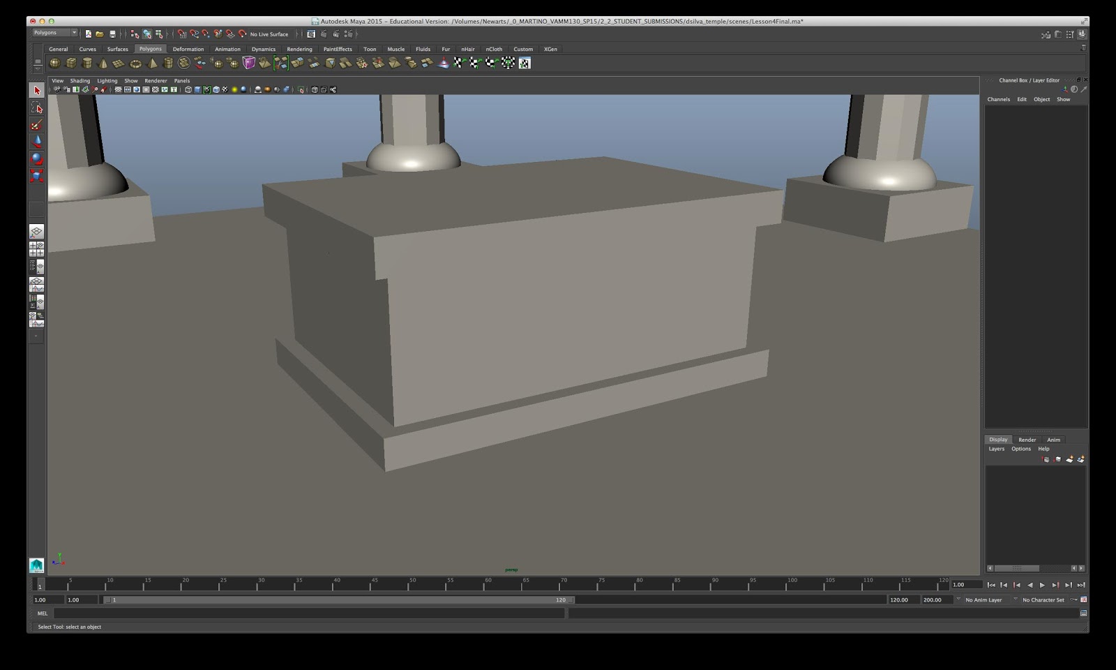
For spring I'm taking two courses at Bucks again, 3-D Modeling Concepts and Foundry, since Professor Mathews of the 3D Arts department told me that many foundries are making use of digital prototyping. I haven't produced anything for Foundry yet although I have my first wax in progress. The first three assignments for Design were a "temple," a sledgehammer and a crowbar.
Slight customizations: The multiple tones and finishes are a departure from the overall "blinn" finish and "sand" color the instructional calls for. The spire and altar are also both mine. These are nothing once you get the basic processes down. The server indicates that a classmate of mine named McCall created a very elaborate piece of architecture for his or her final.
Closeup of the altar.
For the sledgehammer, I went with a lighter tan for the handle, as I'm accustomed to seeing in modern hardware stores, likewise the polished steel faces. No physical customization.
The crowbar, or prybar as the instructional calls it. No customization. It was tricky enough to get right in the first place.
Something went wrong with the curved tip. Both the "front" and "back" faces should extend to the edge; instead, the "front" face above (relative to us) sinks in and actually protrudes a tiny bit in wireframe view. I'm not sure how to correct it yet..
Slight customizations: The multiple tones and finishes are a departure from the overall "blinn" finish and "sand" color the instructional calls for. The spire and altar are also both mine. These are nothing once you get the basic processes down. The server indicates that a classmate of mine named McCall created a very elaborate piece of architecture for his or her final.
Closeup of the altar.
For the sledgehammer, I went with a lighter tan for the handle, as I'm accustomed to seeing in modern hardware stores, likewise the polished steel faces. No physical customization.
The crowbar, or prybar as the instructional calls it. No customization. It was tricky enough to get right in the first place.
Something went wrong with the curved tip. Both the "front" and "back" faces should extend to the edge; instead, the "front" face above (relative to us) sinks in and actually protrudes a tiny bit in wireframe view. I'm not sure how to correct it yet..
Thursday, December 18, 2014
- & final!
My classes came to an end on Monday. Here's what we had left:
Our 3-D Design Fundamentals final was to be a group effort narrating a story of mysterious disaster. We were to have life-sized or near-life-sized figures arranged around campus, in postures of flight or expressing amazement, leading back toward the box, graven with unreadable symbols, where one figure slumped with its hand still resting on the lid.
As the weeks progressed, we had to concede the ambitious nature of this project and reduce it to an interior display. The box itself, of course, was mine.
22-gauge carbon steel, 24 inches on each edge (which is WAY bigger than it sounds - also surprisingly expensive), finished in gold spray paint with the lettering done partly in permanent marker and partly in exterior latex paint. The lettering is an extract from Hesiod's Works and Days telling the story of Pandora's... jar (pithou), not box, but whatever.
I needed a lot of help to hold the pieces together around the spot-welder. The "hinges" are actually bent pieces of 1/8-inch bar stock I had leftover from a knife guard, TIG-welded by a Bucks lab tech (as spot-welding was proving impossible for that particular purpose) - the lid does not open or close.
Our 3-D Design Fundamentals final was to be a group effort narrating a story of mysterious disaster. We were to have life-sized or near-life-sized figures arranged around campus, in postures of flight or expressing amazement, leading back toward the box, graven with unreadable symbols, where one figure slumped with its hand still resting on the lid.
As the weeks progressed, we had to concede the ambitious nature of this project and reduce it to an interior display. The box itself, of course, was mine.
22-gauge carbon steel, 24 inches on each edge (which is WAY bigger than it sounds - also surprisingly expensive), finished in gold spray paint with the lettering done partly in permanent marker and partly in exterior latex paint. The lettering is an extract from Hesiod's Works and Days telling the story of Pandora's... jar (pithou), not box, but whatever.
I needed a lot of help to hold the pieces together around the spot-welder. The "hinges" are actually bent pieces of 1/8-inch bar stock I had leftover from a knife guard, TIG-welded by a Bucks lab tech (as spot-welding was proving impossible for that particular purpose) - the lid does not open or close.
Closeup of the spot-welded interior tabs. Spray-painting is nasty business, particularly in winter; do NOT attempt it if you can't work outside or at least in a garage. The splatters are a result of me sticking my finger too far over the nozzle for leverage; paint would quickly build up on the underside of my finger and fall off in large drops. The amount of paint and primer consumed (and it didn't even provide a good full coat) was another unpleasant surprise.
I didn't want to let all this expense get thrown out, so I offered it to arts dean John Mathews, who said to pick a place outdoors. We placed it in the garden of the Hicks Art Center. It's been two days and I'm not 100-percent sure they'll be okay with my choice, so it may be gone by now.
For Intro to Sculpture, a rather less ambitious project was requested: a memorial, monument or reliquary in wood. I chose to do one for my mother's younger cat, Azabache, who died unexpectedly in October. It shows her as we remember her best, crouched on the dining table with one paw stretched out to take things off your plate without you noticing (or so she apparently imagined).
Most of it is leftover 3/4-inch pine plank, except for the appliqued relief (which is a bit of thin plywood) and the pillars (1-1/4-inch hardwood dowel), together with wood glue and filler. It's finished in interior primer (the white) and various types of paint (as I had on hand for the colors I wanted).
Wednesday, December 3, 2014
Functional?...
Our last assignment in 3-D Design was a functional object made from found objects. I really wanted a belt knife made from a railroad spike, which is a common project for beginning blacksmiths, but practice with a piece of rebar demonstrated that I haven't the stamina for blacksmithing.
I cast about for ideas at the Salvation Army store and this is what I came up with.
The cranium is, I think, the bowl from a small electric mixer. The chin strap isn't from a belt but from a more complicated assemblage of straps, the original purpose of which is a mystery.
Luckily I had some sort of sturdy foam stuff in the basement which was just perfect for this purpose. All metal edges are rolled including on the securing tabs, and the whole thing is held together with rivets, except for the lining, which is epoxied in.
A classmate pointed out that the visor would also be a convenient spot for a lamp. I was originally intending to reinforce the visor with steel rods, but after riveting it, decided it was stiff enough - making it completely collapse-proof would probably be more a hazard to the wearer's neck.
I cast about for ideas at the Salvation Army store and this is what I came up with.
The cranium is, I think, the bowl from a small electric mixer. The chin strap isn't from a belt but from a more complicated assemblage of straps, the original purpose of which is a mystery.
Luckily I had some sort of sturdy foam stuff in the basement which was just perfect for this purpose. All metal edges are rolled including on the securing tabs, and the whole thing is held together with rivets, except for the lining, which is epoxied in.
A classmate pointed out that the visor would also be a convenient spot for a lamp. I was originally intending to reinforce the visor with steel rods, but after riveting it, decided it was stiff enough - making it completely collapse-proof would probably be more a hazard to the wearer's neck.
Sunday, November 16, 2014
A little more art
Last week in sculpture we had a metal-and-found-object project on the theme of "humans and nature." I went for the idea of trying to portray how Bucks County has changed over the years, in three phases: the wilderness, the farms and the big fat suburban houses.
Obviously it suffers from scaling problems. A much larger base would have helped, also allowing the three phases to be clearly separated.
It turned out to be very mixed-media, including plywood, terracotta, polyester felt, sandpaper, two kinds of wood veneer, aluminum wire and sheet, metal primer, acrylic paint, plants from my garden, some ceramic figurines and an old MicroMachine from the '80s or early '90s (whenever I was still collecting those little things).
For 3D Design Fundamentals the week before, we had to turn in a fruit made completely from wire, and a clay prototype and sketches. I used a chilli pepper for no better reason than that I had one in the freezer. I'll admit that I did cheat at just one spot: The three main wire frame pieces are silver soldered to a little bit of copper sheet which represents where the chilli's pointed tip snapped off.
Obviously it suffers from scaling problems. A much larger base would have helped, also allowing the three phases to be clearly separated.
It turned out to be very mixed-media, including plywood, terracotta, polyester felt, sandpaper, two kinds of wood veneer, aluminum wire and sheet, metal primer, acrylic paint, plants from my garden, some ceramic figurines and an old MicroMachine from the '80s or early '90s (whenever I was still collecting those little things).
For 3D Design Fundamentals the week before, we had to turn in a fruit made completely from wire, and a clay prototype and sketches. I used a chilli pepper for no better reason than that I had one in the freezer. I'll admit that I did cheat at just one spot: The three main wire frame pieces are silver soldered to a little bit of copper sheet which represents where the chilli's pointed tip snapped off.
Sunday, October 19, 2014
3-D design and intro to sculpture backlog
I've already published my second assignment in 3-D design fundamentals, Project XYZ, so let's back up a bit. Our very first assignment (which I didn't initially post since it didn't seem like a major one) was a representation of "order" and "chaos" and the connection between them, in string.
Order. From Middle English ordre, from Old French ordre, ordne, ordene (“order, rank”), from Latin ōrdinem, accusative of ōrdō (“row, rank, regular arrangement”, literally “row of threads in a loom”), from Proto-Italic *ored(h)- (“to arrange”), of unknown origin.
Chaos. Borrowed from Ancient Greek χάος (kháos, “vast chasm, void”).
In Greek mythology, everything arose from the primordial chaos. Thus the basic concept here is that order is made from chaos through action (as Death has said, "THERE IS NO GOOD ORDER EXCEPT THAT WHICH WE CREATE."). On the other hand, order is inevitably destroyed through entropy, thus the string leads from chaos to order and back to chaos.
For this assignment, obviously the result was going to be very abstract. If I'd had more time, I'd have used a lot more string and glue to make "chaos" more three-dimensional, and a thinner frame for "order" so there'd be more emphasis on the string and not the wood, also tried to make it actually look like a loom and not just evocative of one (though as built, it was effective enough; several people told me they thought at first that it was an actual miniature loom).
The third assignment (after Project XYZ) was for a word or letter in 3D form.
"In the beginning there was the Word, and the Word was with God, and the Word was God."
En arche en ho Logos, kai ho Logos en pros ton Theon, kai Theos en ho Logos. - John 1:1
I wanted the image to look imposing and eternal - which is ironic, because this heavily recycled terracotta crumbles easily. You can't really see it because of the angle, but the base bowed up in the middle dramatically as it dried. On the right near the bottom is the protruding butt of a bamboo skewer I used to reinforce the base, revealed as the clay shrank while drying.
Our third assignment was for a polyhedron made of flat material.
A mysterious artefact from forgotten ages. Who knows what message its strange symbols encode? (Answer: nothing, I made them up as I went along.)
Technically this is a truncated hexagonal pyramid, in 0.005-inch sheet brass. I chose a relatively simple shape because the embossing (done with a dried-up ballpoint pen) is very time-consuming. The shape is closed with silver solder, which practically ruined the flawless burnished finish I'd given it before folding. I managed to correct it somewhat, but it's still rather ugly.
We've had only one assignment in sculpture, a piece on "community and identity" done at least partly with casting.
About 12 or 13 years ago, my high school literature class was reading Siddhartha by Hermann Hesse, and a classmate said something about an archaetype (I believe a psychological archaetype, but I may be misremembering) of the "self" represented as a figure sitting in the lotus position. That notion is what I based this image on. It's personalized in that I for one cannot sit in the lotus position comfortably, but I often find myself sitting in what could be described as a degraded form of it, with one shin (both knee and ankle) sitting entirely on top of the other, and my head resting on my hand.
The sculpture is investment-cast in concrete from a clay original; on the left is the study for it. The left foot didn't turn out, so I built a "shoe" by pressing thick concrete directly onto the stump. I also rasped some detailing in (pants pockets and other clothing details).
Order. From Middle English ordre, from Old French ordre, ordne, ordene (“order, rank”), from Latin ōrdinem, accusative of ōrdō (“row, rank, regular arrangement”, literally “row of threads in a loom”), from Proto-Italic *ored(h)- (“to arrange”), of unknown origin.
Chaos. Borrowed from Ancient Greek χάος (kháos, “vast chasm, void”).
In Greek mythology, everything arose from the primordial chaos. Thus the basic concept here is that order is made from chaos through action (as Death has said, "THERE IS NO GOOD ORDER EXCEPT THAT WHICH WE CREATE."). On the other hand, order is inevitably destroyed through entropy, thus the string leads from chaos to order and back to chaos.
For this assignment, obviously the result was going to be very abstract. If I'd had more time, I'd have used a lot more string and glue to make "chaos" more three-dimensional, and a thinner frame for "order" so there'd be more emphasis on the string and not the wood, also tried to make it actually look like a loom and not just evocative of one (though as built, it was effective enough; several people told me they thought at first that it was an actual miniature loom).
The third assignment (after Project XYZ) was for a word or letter in 3D form.
"In the beginning there was the Word, and the Word was with God, and the Word was God."
En arche en ho Logos, kai ho Logos en pros ton Theon, kai Theos en ho Logos. - John 1:1
I wanted the image to look imposing and eternal - which is ironic, because this heavily recycled terracotta crumbles easily. You can't really see it because of the angle, but the base bowed up in the middle dramatically as it dried. On the right near the bottom is the protruding butt of a bamboo skewer I used to reinforce the base, revealed as the clay shrank while drying.
Our third assignment was for a polyhedron made of flat material.
A mysterious artefact from forgotten ages. Who knows what message its strange symbols encode? (Answer: nothing, I made them up as I went along.)
Technically this is a truncated hexagonal pyramid, in 0.005-inch sheet brass. I chose a relatively simple shape because the embossing (done with a dried-up ballpoint pen) is very time-consuming. The shape is closed with silver solder, which practically ruined the flawless burnished finish I'd given it before folding. I managed to correct it somewhat, but it's still rather ugly.
We've had only one assignment in sculpture, a piece on "community and identity" done at least partly with casting.
About 12 or 13 years ago, my high school literature class was reading Siddhartha by Hermann Hesse, and a classmate said something about an archaetype (I believe a psychological archaetype, but I may be misremembering) of the "self" represented as a figure sitting in the lotus position. That notion is what I based this image on. It's personalized in that I for one cannot sit in the lotus position comfortably, but I often find myself sitting in what could be described as a degraded form of it, with one shin (both knee and ankle) sitting entirely on top of the other, and my head resting on my hand.
The sculpture is investment-cast in concrete from a clay original; on the left is the study for it. The left foot didn't turn out, so I built a "shoe" by pressing thick concrete directly onto the stump. I also rasped some detailing in (pants pockets and other clothing details).
Friday, September 19, 2014
Project XYZ
This is the first major assignment in the 3-D design fundamentals class I'm currently taking, creating a sculpture with shapes defining it along X (width), Y (height) and Z (depth) axe, made of flat, intersecting segments. Unfortunately our professor had to go on some sort of business trip and the professor who substituted last week had a very different idea of what the assignment involved - our regular professor wanted only right angles but would've accepted closed structures, while the one who covered for her wanted open structures but would've allowed curved lines. I wound up following both restrictions.
I initially wanted to make a castle, but using an open structure would've required far too much work. Instead I just went for the front wall with its two turrets and fortified gate. Even just that required several hours of drafting and calculations to ensure the pieces actually fit together.
I used cardboard, and initially wanted to cut with a box cutter, but after the first stroke left me a ragged lower edge and a jab in the thigh, I instead resorted to tedious punching and sawing with a hobby knife. As you can see, the pieces are actually fitted together with slots.
The whole thing is assembled with paper tape and the edges sealed with strips of scrap paper and glue. A classmate pointed out that the tape remained visible through the paint and perhaps glueing the main pieces together would've been preferable.
The paint is spray-on metal primer detailed with cheap poster paint.
I don't like this thing. I dislike the whole XYZ sculpture style. I think it looks like a boxed craft project for grade schoolers.
I initially wanted to make a castle, but using an open structure would've required far too much work. Instead I just went for the front wall with its two turrets and fortified gate. Even just that required several hours of drafting and calculations to ensure the pieces actually fit together.
I used cardboard, and initially wanted to cut with a box cutter, but after the first stroke left me a ragged lower edge and a jab in the thigh, I instead resorted to tedious punching and sawing with a hobby knife. As you can see, the pieces are actually fitted together with slots.
The whole thing is assembled with paper tape and the edges sealed with strips of scrap paper and glue. A classmate pointed out that the tape remained visible through the paint and perhaps glueing the main pieces together would've been preferable.
The paint is spray-on metal primer detailed with cheap poster paint.
I don't like this thing. I dislike the whole XYZ sculpture style. I think it looks like a boxed craft project for grade schoolers.
Wednesday, August 20, 2014
Digital imaging class, part II
And these are the Illustrator assignments.
"Expressive words."
Creating a simple repeating pattern. I didn't like how the first set of "spheres" looked when right up against each other, so I did the second one as a compromise.
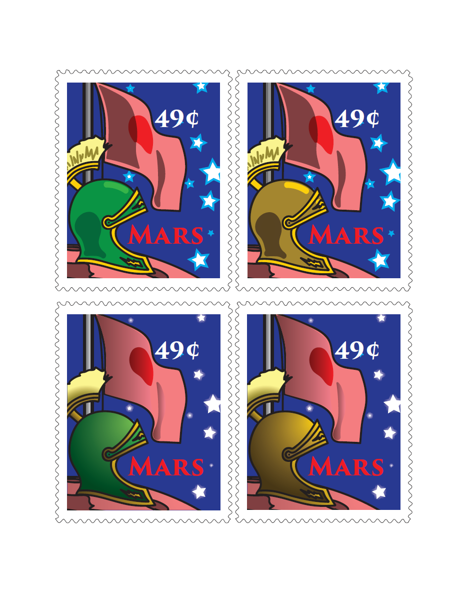
A set of stamps commemorating something. I did not invent the flag; it's the actual one used in Duck Dodgers in the 24½th Century.
Two versions of a PSA on the same topic. I had a classroom/office poster in mind, which is why there's so much text. It should've been a bit lighter if it were to be made into a billboard or something.
Not making this up - the day I chose the topic, a friend of mine from high school contracted food poisoning from eating at a Philly restaurant. (She's okay now.)
Sunday, August 17, 2014
Digital imaging class, part I
Just finished a course at Bucks County Community College last week learning to use Photoshop and Illustrator. Here's the Photoshop assignments:
An "about me" page introducing ourselves to classmates.
Pick a color and go off on how it might be used and its connotations.
Subscribe to:
Posts (Atom)