Friday, December 26, 2014

You knew this was coming

 A few years ago, I was infected with an idea WAY beyond my means, tenacity or creativity:  collating the entirety of Arthurian mythology into a cohesive comic series.  Well, obviously, that wasn't gonna happen, but I figured I'd put the idea out anyway.

Left:  Actually, to me "King Arthur" is Graham Chapman, but he wouldn't have fit the tone of the story.

Right:  Gwenhwyfar ferch Ogrfan Gawr 
Drwg yn fechan, gwaeth yn fawr. 
"Gwenhwyfar, daughter of Ogrfan Gawr,
Bad when little, worse when great."

If my Arthur looks familiar to you, you probably need no explanation about whom Guinevere's design is cribbed from.

Left to right:  Lancelot, Mordred, Gawain and Bedivere.  I meant for Gawain to look young yet steely, instead I think he looks like an unlikeable teen pop star.  Mordred is my favorite; it wasn't my intention, but he's basically an older Christopher Robin.  I could never settle on a good design for Lancelot, but I knew Bedivere was to have a moustache.

Enemies!  The two on the left are a couple designs for Ælle, king of the South Saxons - the kingdom that later became Sussex.  The smaller guy's helmet is based on the Berkasavo find, which is quite far out of time and place; the larger one is based on later Germanic designs.  As far as I know, there are no finds of helmets from turn-of-the-sxith-century Britain.

On the top right is Oisc of Kent (some detail seems to have been lost in the process of adjusting scanner settings) and on the bottom, Meleagant or Melwas.

Ymddiddan Melwas a Gwenhwyfar.  Melwas vaunts his successful kidnapping of the Queen before Gwynn ap Nudd, king of Annwn.  Gwenhwyfar is not impressed and prepares to call him out for having ambushed Cai.  Then she spies a small man in black and yellow standing nearby.

A soap opera moment:  Kay confronts Guinevere about her affair with Lancelot.  This scene isn't based on any legendary account and is just a study for how characters might interact over the course of the series.  Kay is impetuous, but I like to think he's smarter than he looks, and not malicious.  So he won't be the one to tell Arthur what's going on.

As for Guinevere, too eager to please her family and friends, and thinking things would work out for the best, she agreed to marry a man who's madly in love with her but whom she only likes as a friend.  The temptation when she met someone for whom she did feel true passion, and the guilt accompanying it...  her position is extremely unenviable.


Right:  Arthur sometime between Kay's death and Camlann.  It would have been by design that he doesn't grow up so much as wear out, becoming gaunt and empty-eyed in his 20s.


Left:  Long before she was Arthur's creepy half-sister, she was the benevolent but distant queen of Avalon.  Standard modern elf design mixed with a soupçon of Maleficent (the only character or element I liked about Sleeping Beauty).


Thursday, December 18, 2014

- & final!

My classes came to an end on Monday.  Here's what we had left:

Our 3-D Design Fundamentals final was to be a group effort narrating a story of mysterious disaster.  We were to have life-sized or near-life-sized figures arranged around campus, in postures of flight or expressing amazement, leading back toward the box, graven with unreadable symbols, where one figure slumped with its hand still resting on the lid.

As the weeks progressed, we had to concede the ambitious nature of this project and reduce it to an interior display.  The box itself, of course, was mine.

22-gauge carbon steel, 24 inches on each edge (which is WAY bigger than it sounds - also surprisingly expensive), finished in gold spray paint with the lettering done partly in permanent marker and partly in exterior latex paint.  The lettering is an extract from Hesiod's Works and Days telling the story of Pandora's...  jar (pithou), not box, but whatever.

 I needed a lot of help to hold the pieces together around the spot-welder.  The "hinges" are actually bent pieces of 1/8-inch bar stock I had leftover from a knife guard, TIG-welded by a Bucks lab tech (as spot-welding was proving impossible for that particular purpose) - the lid does not open or close.

Closeup of the spot-welded interior tabs.  Spray-painting is nasty business, particularly in winter; do NOT attempt it if you can't work outside or at least in a garage.  The splatters are a result of me sticking my finger too far over the nozzle for leverage; paint would quickly build up on the underside of my finger and fall off in large drops.  The amount of paint and primer consumed (and it didn't even provide a good full coat) was another unpleasant surprise.

I didn't want to let all this expense get thrown out, so I offered it to arts dean John Mathews, who said to pick a place outdoors.  We placed it in the garden of the Hicks Art Center.  It's been two days and I'm not 100-percent sure they'll be okay with my choice, so it may be gone by now.


For Intro to Sculpture, a rather less ambitious project was requested:  a memorial, monument or reliquary in wood.  I chose to do one for my mother's younger cat, Azabache, who died unexpectedly in October.  It shows her as we remember her best, crouched on the dining table with one paw stretched out to take things off your plate without you noticing (or so she apparently imagined).

Most of it is leftover 3/4-inch pine plank, except for the appliqued relief (which is a bit of thin plywood) and the pillars (1-1/4-inch hardwood dowel), together with wood glue and filler.  It's finished in interior primer (the white) and various types of paint (as I had on hand for the colors I wanted).

Wednesday, December 3, 2014

Functional?...

Our last assignment in 3-D Design was a functional object made from found objects.  I really wanted a belt knife made from a railroad spike, which is a common project for beginning blacksmiths, but practice with a piece of rebar demonstrated that I haven't the stamina for blacksmithing.

I cast about for ideas at the Salvation Army store and this is what I came up with.

The cranium is, I think, the bowl from a small electric mixer.  The chin strap isn't from a belt but from a more complicated assemblage of straps, the original purpose of which is a mystery.

Luckily I had some sort of sturdy foam stuff in the basement which was just perfect for this purpose.  All metal edges are rolled including on the securing tabs, and the whole thing is held together with rivets, except for the lining, which is epoxied in.

A classmate pointed out that the visor would also be a convenient spot for a lamp.  I was originally intending to reinforce the visor with steel rods, but after riveting it, decided it was stiff enough - making it completely collapse-proof would probably be more a hazard to the wearer's neck.

Sunday, November 16, 2014

A little more art

Last week in sculpture we had a metal-and-found-object project on the theme of "humans and nature."  I went for the idea of trying to portray how Bucks County has changed over the years, in three phases:  the wilderness, the farms and the big fat suburban houses.

Obviously it suffers from scaling problems.  A much larger base would have helped, also allowing the three phases to be clearly separated.

It turned out to be very mixed-media, including plywood, terracotta, polyester felt, sandpaper, two kinds of wood veneer, aluminum wire and sheet, metal primer, acrylic paint, plants from my garden, some ceramic figurines and an old MicroMachine from the '80s or early '90s (whenever I was still collecting those little things).

For 3D Design Fundamentals the week before, we had to turn in a fruit made completely from wire, and a clay prototype and sketches.  I used a chilli pepper for no better reason than that I had one in the freezer.  I'll admit that I did cheat at just one spot:  The three main wire frame pieces are silver soldered to a little bit of copper sheet which represents where the chilli's pointed tip snapped off.

Tuesday, October 21, 2014

Fun with polymer clay

A collection of ships, rocketships and space pods, in various scales, which I made over a period from high school (the little blue and yellow spaceship near the right) to just last year (some of the retro-style rocketships on the left).

The big blue-grey battleship, made in 2011, is something of a magnum opus for my polymer clay work.  It's a great medium, but it has its limits; unlike the semi-flexible plastic MicroMachines uses for certain sci-fi merchandise, thin elements in polymer clay WILL wind up breaking if you so much as carry them around in your pockets.

Sunday, October 19, 2014

3-D design and intro to sculpture backlog

I've already published my second assignment in 3-D design fundamentals, Project XYZ, so let's back up a bit.  Our very first assignment (which I didn't initially post since it didn't seem like a major one) was a representation of "order" and "chaos" and the connection between them, in string.

Order.  From Middle English ordre, from Old French ordre, ordne, ordene (“order, rank”), from Latin ōrdinem, accusative of ōrdō (“row, rank, regular arrangement”, literally “row of threads in a loom”), from Proto-Italic *ored(h)- (“to arrange”), of unknown origin.

Chaos.  Borrowed from Ancient Greek χάος (kháos, “vast chasm, void”).

In Greek mythology, everything arose from the primordial chaos.  Thus the basic concept here is that order is made from chaos through action (as Death has said, "THERE IS NO GOOD ORDER EXCEPT THAT WHICH WE CREATE.").  On the other hand, order is inevitably destroyed through entropy, thus the string leads from chaos to order and back to chaos.

For this assignment, obviously the result was going to be very abstract.  If I'd had more time, I'd have used a lot more string and glue to make "chaos" more three-dimensional, and a thinner frame for "order" so there'd be more emphasis on the string and not the wood, also tried to make it actually look like a loom and not just evocative of one (though as built, it was effective enough; several people told me they thought at first that it was an actual miniature loom).

The third assignment (after Project XYZ) was for a word or letter in 3D form.

"In the beginning there was the Word, and the Word was with God, and the Word was God."
 En arche en ho Logos, kai ho Logos en pros ton Theon, kai Theos en ho Logos.  -  John 1:1

I wanted the image to look imposing and eternal - which is ironic, because this heavily recycled terracotta crumbles easily.  You can't really see it because of the angle, but the base bowed up in the middle dramatically as it dried.  On the right near the bottom is the protruding butt of a bamboo skewer I used to reinforce the base, revealed as the clay shrank while drying.

Our third assignment was for a polyhedron made of flat material.

A mysterious artefact from forgotten ages.  Who knows what message its strange symbols encode?  (Answer:  nothing, I made them up as I went along.)

Technically this is a truncated hexagonal pyramid, in 0.005-inch sheet brass.  I chose a relatively simple shape because the embossing (done with a dried-up ballpoint pen) is very time-consuming.  The shape is closed with silver solder, which practically ruined the flawless burnished finish I'd given it before folding.  I managed to correct it somewhat, but it's still rather ugly.

We've had only one assignment in sculpture, a piece on "community and identity" done at least partly with casting.

About 12 or 13 years ago, my high school literature class was reading Siddhartha by Hermann Hesse, and a classmate said something about an archaetype (I believe a psychological archaetype, but I may be misremembering) of the "self" represented as a figure sitting in the lotus position.  That notion is what I based this image on.  It's personalized in that I for one cannot sit in the lotus position comfortably, but I often find myself sitting in what could be described as a degraded form of it, with one shin (both knee and ankle) sitting entirely on top of the other, and my head resting on my hand.

The sculpture is investment-cast in concrete from a clay original; on the left is the study for it.  The left foot didn't turn out, so I built a "shoe" by pressing thick concrete directly onto the stump.  I also rasped some detailing in (pants pockets and other clothing details).

Monday, October 13, 2014

Things That Aren't Here Anymore, part IV

The limbed trunk of one of Newtown's dwindling number of huge old beech trees, on the front lawn of a house between George School and Newtown Friends School (it belongs to one of them, but I'm not sure which).  I took this photo last year.  I don't know when the trunk was finally cut down, but it's gone now.

Dead tree trunks are rarely of much interest to me, but this one was kinda neat.  With its sides mantled in vines, I always thought it looked like a cliff or mountainside.

Saturday, September 20, 2014

Too much is never enough

Battleship Bismarck in the famous Baltic camouflage paint scheme.  All polymer clay with only a bit of wire for the masts.

Swastikas?  No, even if I wanted to include them, at this scale it's impossible.  Those are just smudges.

What is that scale, you ask?  I estimate it to be between 1:6500 and 1:6600.  For reference, I believe naval wargaming miniatures "mini out" at 1:6000, with larger scales being more common.

Friday, September 19, 2014

Project XYZ

This is the first major assignment in the 3-D design fundamentals class I'm currently taking, creating a sculpture with shapes defining it along X (width), Y (height) and Z (depth) axe, made of flat, intersecting segments.  Unfortunately our professor had to go on some sort of business trip and the professor who substituted last week had a very different idea of what the assignment involved - our regular professor wanted only right angles but would've accepted closed structures, while the one who covered for her wanted open structures but would've allowed curved lines.  I wound up following both restrictions.

I initially wanted to make a castle, but using an open structure would've required far too much work.  Instead I just went for the front wall with its two turrets and fortified gate.  Even just that required several hours of drafting and calculations to ensure the pieces actually fit together.

 I used cardboard, and initially wanted to cut with a box cutter, but after the first stroke left me a ragged lower edge and a jab in the thigh, I instead resorted to tedious punching and sawing with a hobby knife.  As you can see, the pieces are actually fitted together with slots.

 The whole thing is assembled with paper tape and the edges sealed with strips of scrap paper and glue.  A classmate pointed out that the tape remained visible through the paint and perhaps glueing the main pieces together would've been preferable.

The paint is spray-on metal primer detailed with cheap poster paint.

I don't like this thing.  I dislike the whole XYZ sculpture style.  I think it looks like a boxed craft project for grade schoolers.

Thursday, September 18, 2014

Things That Aren't Here Anymore, part III

Newtown Station in the summer of 2004, 21 years after train service stopped.  Newtown used to be the final stop on the R8 line, which passed over Neshaminy Creek and behind George School.  The abandoned tracks can be followed as far as the creek, and fences are regularly installed there which George School students just as regularly cut through so they can hang out on the crumbling bridge.  After 1983, service was cut off north of Fox Chase, although the map at the Langhorne station wasn't replaced until 2000 or 2001 and, if I recall, just had corrections scribbled on in permanent marker.

The other end of the R8 line is in Chestnut Hill.  If I'd gone to Crefeld* 20 years earlier, I could've strolled down the road and dozed off on the train the entire way.

The little shelter, one of the few relics you could easily and safely stroll into, has since been removed, although another one remains at the still-operational SEPTA bus stop a short distance away.

The parking lot, such as it is, remains, but the name of the station has been co-opted by a group of expensive Toll Brothers condos behind the station where Frost-Watson Lumber Corp. used to be.  It was, ironically, the fact that big builders such as Toll Brothers have vertically integrated their own lumber yards that drove companies like Frost-Watson out of business; they weren't needed anymore.

* I don't know when the name changed from Miquon Upper.  It is always stressed that Miquon Upper and Crefeld are the same school; nothing officially changed except the name.

Wednesday, August 20, 2014

Digital imaging class, part II

And these are the Illustrator assignments.

"Expressive words."

 Creating a simple repeating pattern.  I didn't like how the first set of "spheres" looked when right up against each other, so I did the second one as a compromise.

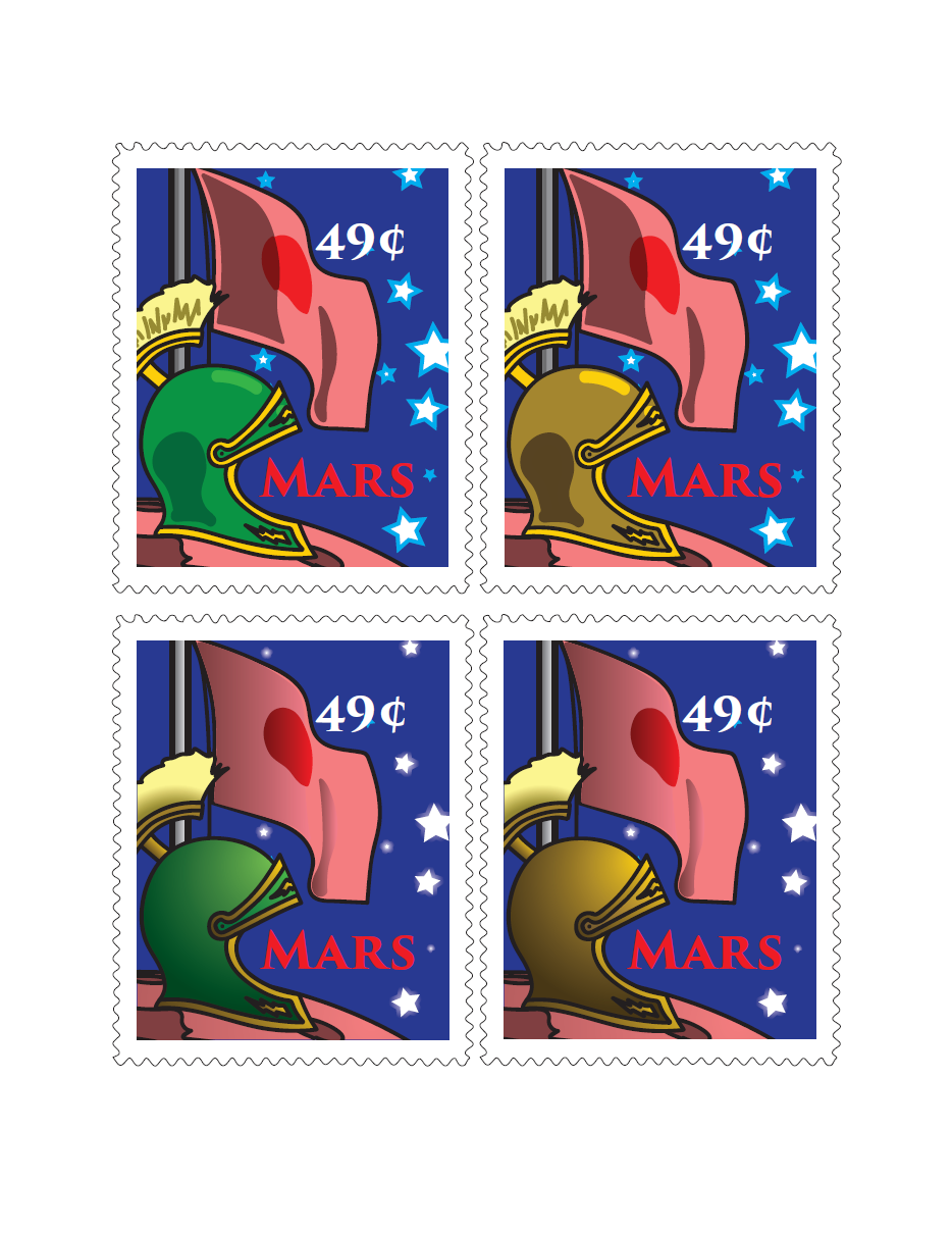
A set of stamps commemorating something.  I did not invent the flag; it's the actual one used in Duck Dodgers in the 24½th Century.

Two versions of a PSA on the same topic.  I had a classroom/office poster in mind, which is why there's so much text.  It should've been a bit lighter if it were to be made into a billboard or something.

Not making this up - the day I chose the topic, a friend of mine from high school contracted food poisoning from eating at a Philly restaurant.  (She's okay now.)

Sunday, August 17, 2014

Digital imaging class, part I

Just finished a course at Bucks County Community College last week learning to use Photoshop and Illustrator.  Here's the Photoshop assignments:

An "about me" page introducing ourselves to classmates.

Pick a color and go off on how it might be used and its connotations.

Eliminating phone wires and weeds on the ground in front of the Mummers Museum in Philadelphia.

Rejuvenation through the magic of computers.  I think too much airbrushing makes skin look like plastic.

Monday, July 21, 2014

Oh good, more balsa


Battlecruiser Hood, 1940 refit.  This model is about 10 years old; I don't think I'd have the fortitude to put this much work into anything nowadays.

I submitted some (poorer-quality) photos back then to The HMS Hood Association but I think something went wrong with their uploads because I could never view them at full size.

For your consideration is this high-res photo in all its rough, crooked, scratchbuilt glory.  1:1200 scale.